ArtCurious
Where will your curiousity draw you?
iOS Mobile Screens
Role
End-to-End UX Designer
UX Researcher
UI Designer
Branding & Graphic Design
Timeline
4 weeks (Oct. 10 - Nov. 11)
Tools
Figma
Figjam
Zoom for Moderated Testing
Notion
A Passion Leads to a New Venture


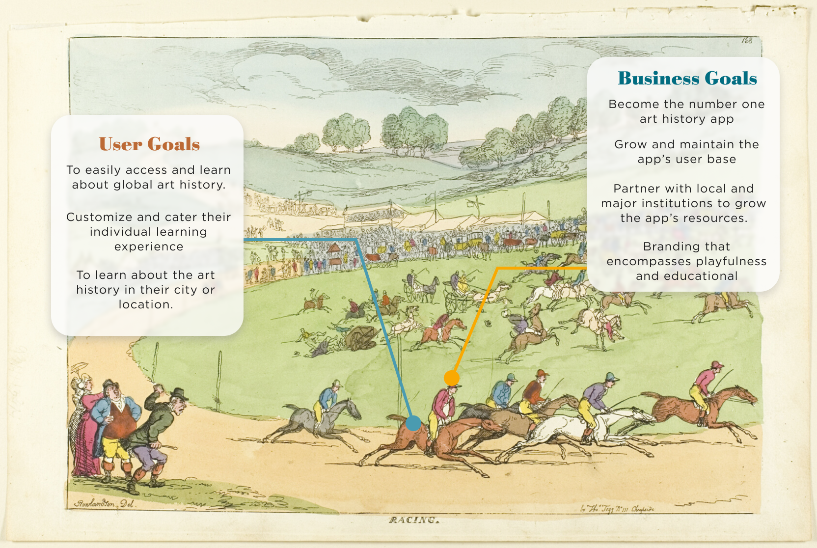
What is ArtCurious Trying to Solve?

Do Users Even Like Art History?
I’m not going to lie, I had some assumptions before starting the research process. I thought the least popular museum would be an art museum and that there was no big interest in art history.

Art History Survey
The survey was utilized to gain a broad understanding of users’ art history experiences, museum experiences, and how they learn new skills. This survey also served as a screener for user interviews.


Time to Get More In-depth Answers
Let’s Check Out the Competition
The art history app market is small so the best way ArtCurious can stand out is with its features.


We Have the Results, Let’s Start Designing
The results of the research left me feeling both delighted in being wrong about my assumptions and confident in what direction I wanted to go for ArtCurious.
Initially the app was going to be focused on a user’s museum experience, but it refocused on becoming an art history education app.
Meet Darrell & Arlene

What Are the Most Important Features?
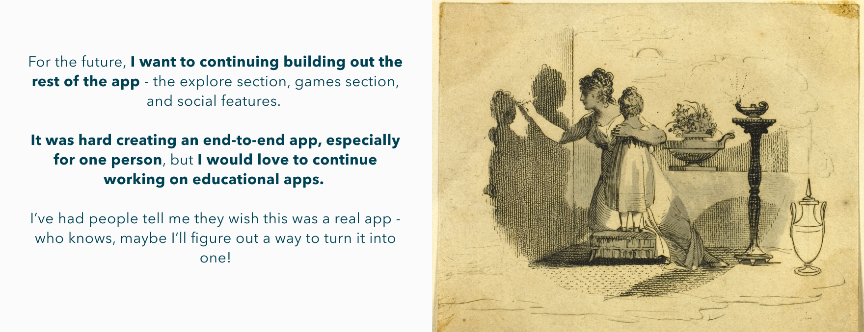
The best and worst thing about creating a new app is you think of all these features that would help make your app’s MVP stand out. A lot of the features I wanted for the app such as games, a social feature, and even a notes feature, were not feasible for the short timeline.
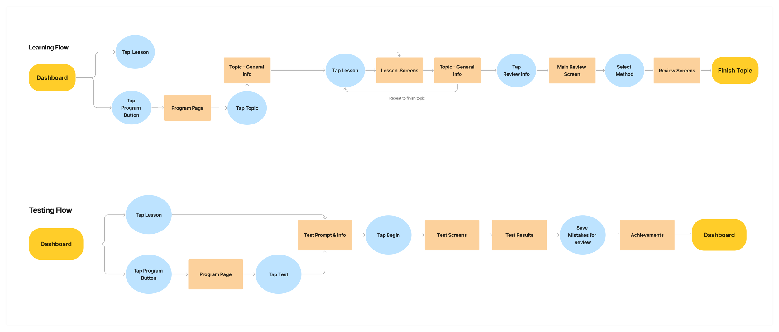
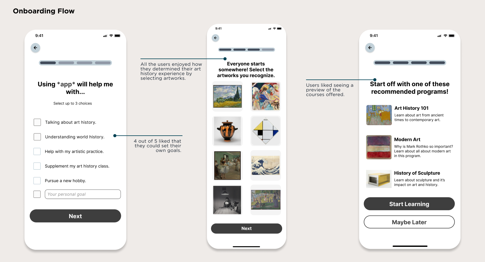
What Journeys Can the User Go On?
With the MVP decided, it was time to begin working on the user and task flows to determine navigation. I also worked on the information architecture simultaneously, making changes as I saw the skeleton of ArtCurious taking shape.
Let’s Bring ArtCurious to Life
Referencing ArtCurious’ competition and educational apps, I sketched on notecards to create variations of ArtCurious’ screens, mixing and matching to create the strongest flows.
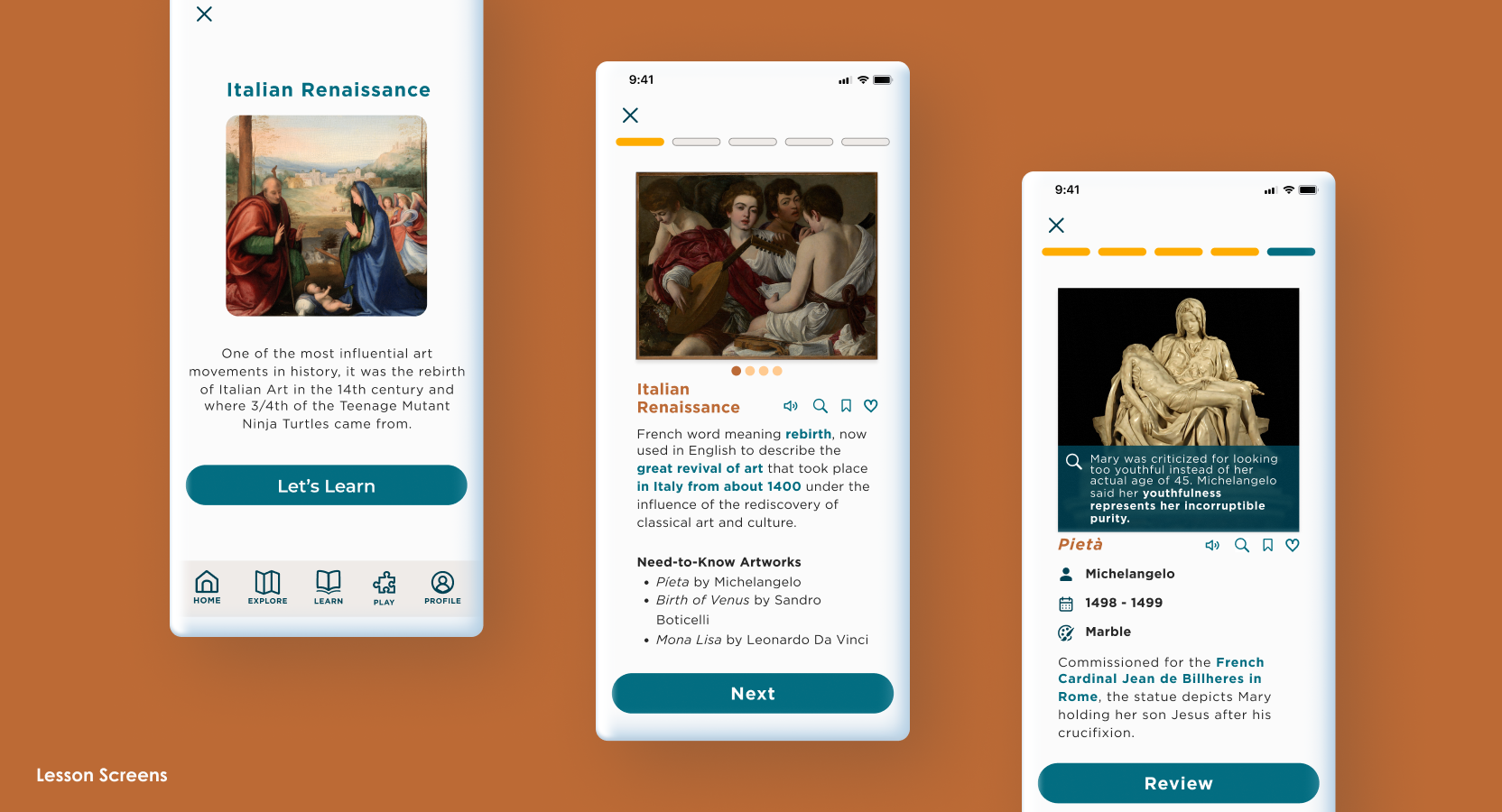
Lesson Flow
You know who has great flows for learning? Duolingo (and LingoDeer)! Both apps engage the user through short, simple presentations with a high level of interactivity.
This design presentation is what I referenced when creating the ArtCurious screens. The biggest difference was how to present art history information while still engaging the user (avoiding short-term memorization).

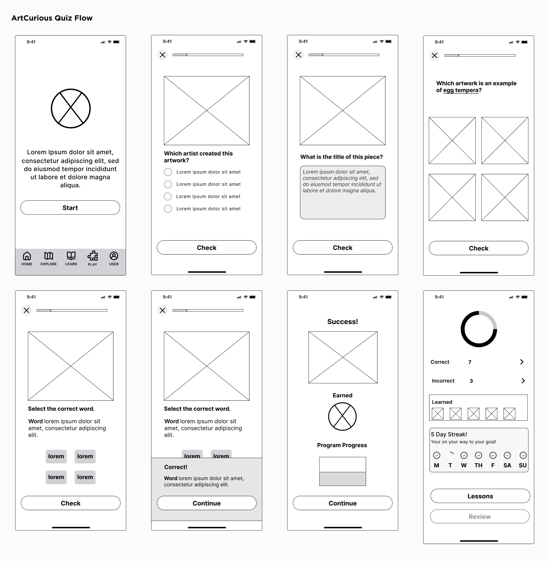
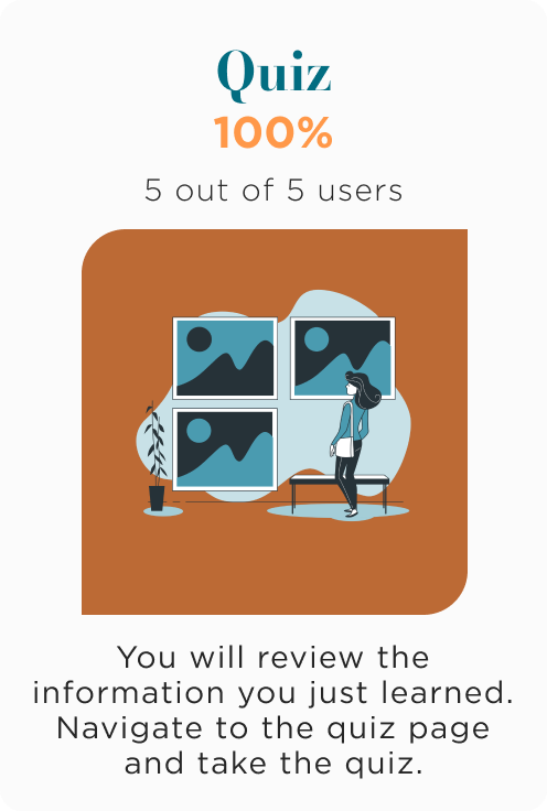
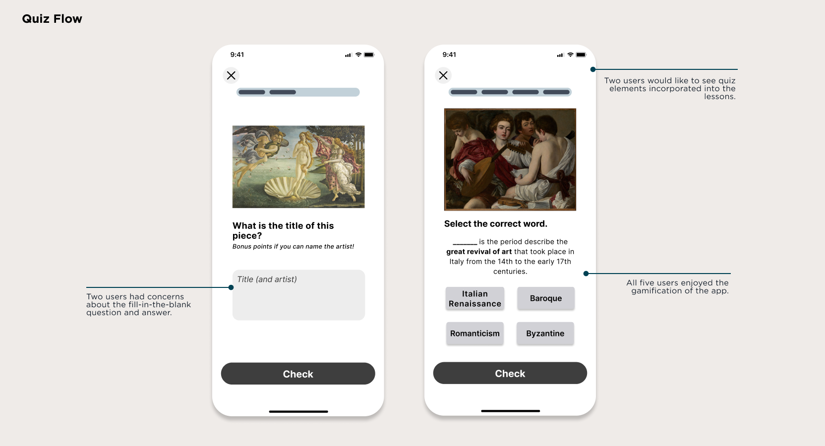
Quiz Flow
From my research, quizzes are one of the ways that users learn and maintain information. I knew ArtCurious needed to have a quiz/testing feature, but I still wanted to make engaging and friendly.
I played up the gamification that inspired the app and implemented those ideas into the quiz screens.
Preparation for Testing
Lesson Flow
To prepare for user testing, I began adding in artworks along with UX writing to create a more immersive experience for testing.
One of the things I wanted feedback on was how to present the Fun Fact pop-up, which for this test was just a gray dot on the image. Is that how I wanted to present it? Absolutely not, but I knew that I would get feedback from my users on how to move forward.
Quiz Flow
The quiz flow screens actually didn’t deviate too far from my original wireframes.
What I was really stuck on with these screens was the graphics (of all things). Do I incorporate a cute mascot? Do I create my own illustrations? Would that trivialize the user’s experience?

Does ArtCurious Even Work?
Over the course of three days, five users completed moderated ArtCurious mid-fidelity prototype testing. By chance, two of the users had never taken an art history class and I found their input incredibly helpful.


Overall, users really enjoyed their experience with the app and offered helpful feedback for areas I was having trouble on like the Fun Fact pop-up and incorporating quiz elements into the Lesson flow.

Who is ArtCurious?
ArtCurious encompasses curiosity, academia, modernity, and wonder. Inspired by one of my favorite undergraduate art history professors, it has a fun and educational vibe that allows users to learn about the world through art history.

Meet Your New Favorite Art History App
Lesson Flow
I added a review feature during the lesson so users could practice their knowledge that they’ve learned so far with a mini pop-quiz.
The Fun Fact pop-up now has its home! Users can now click on the magnifying glass in the icons menu to learn an interesting fact about an artist, artwork, movement, and more.

Quiz Flow
Who needs cute graphics when you have an entire collection of artwork? Rather than trying to rack my brain for a good representative mascot, I decided to play up the humor and use artworks as my graphics and icons (inspired by art history memes and LACMA’s Instagram).
All the screens stayed the same with very minor UX and UI changes.