
Nike Training Club
Training for Every Body and Mind
Conceptual Android Mobile Screens
Role
UX Designer
UX Researcher
Timeline
3 weeks (Sep. 12 - Oct. 4)
Tools
Figma
Figjam
Maze for unmoderated testing
Notion
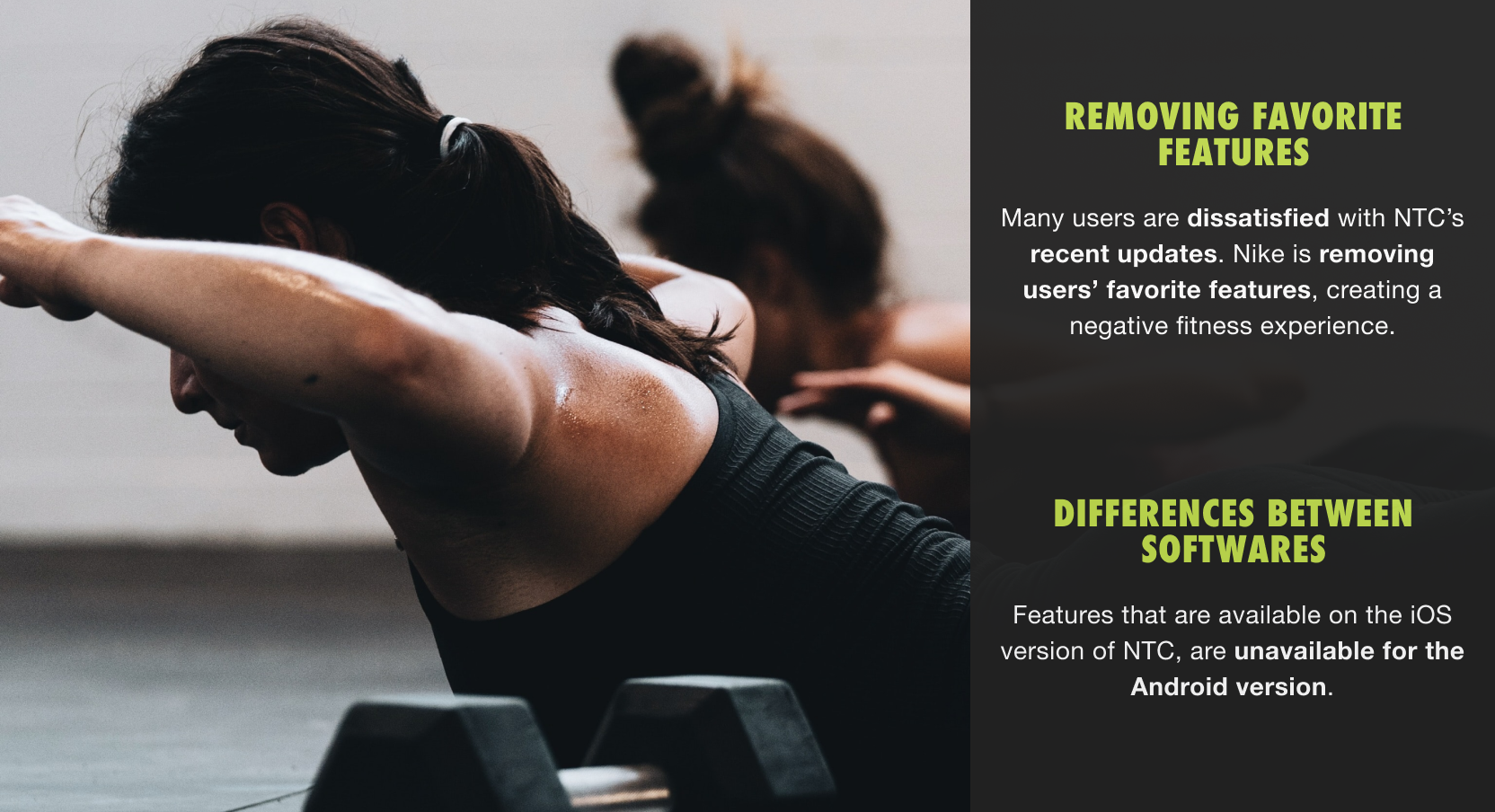
What Happens When You Use the App You’re Designing For?

With three hypothetical changes, I believe that NTC users would have a much more enjoyable experience on the app.
Reminder: Listen to Your Users
What do Nike and Their Users Have in Common?
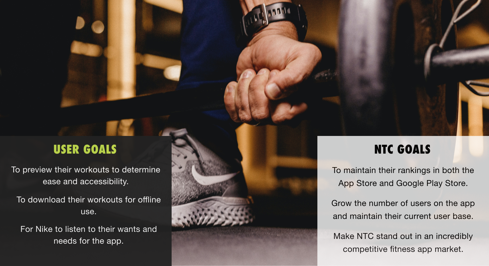
Do Other Users Think Like I Do?
Research Goal
The main research goal was understand how users organize and schedule their workouts to maintain their fitness journey.
Research Objectivess
To determine what pain points current NTC users have with the app.
Learn how users plan and execute their workouts.
To learn what formats users enjoy doing for workouts.
Discover what competitors are doing to attract users to their apps and keep them loyal.
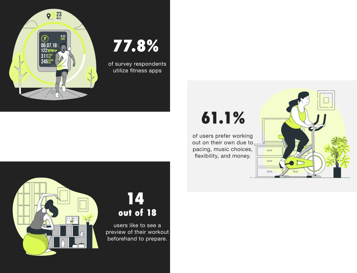
Fitness Habits Survey
Over the course of a week, 18 participants took the Fitness Habits survey. This also served as a screening process for user interviews.
User Interviews
Three users participated in research interviews where they were asked about their fitness habits, how they maintain their fitness habits and their favorite apps.
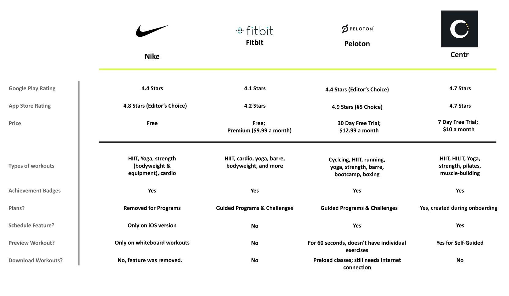
What Makes Nike’s Competitors Stand Out?
Let’s Think of This As A Minor Remodel
Through my research, I discovered that iPhone users and Android users are split down the middle. NTC’s scheduling feature is only available on iOS so I decided to focus on Android for my screens.
Since most research participants stated they enjoy doing individual workouts, it’s critical to consider ways for users to control their workout experience.
Meet Wendy

I created the user and task flows before working on the information architecture to see how users would navigate through the new features. Once I had a good understanding of the flow, I began integrating my features into the app’s existing architecture.
Notecards Are Fantastic For Mobile Screens
I thoroughly enjoyed my sketching process this time because I worked on notecards. This made it easier to mix and match screens in a flow along with paper prototyping.
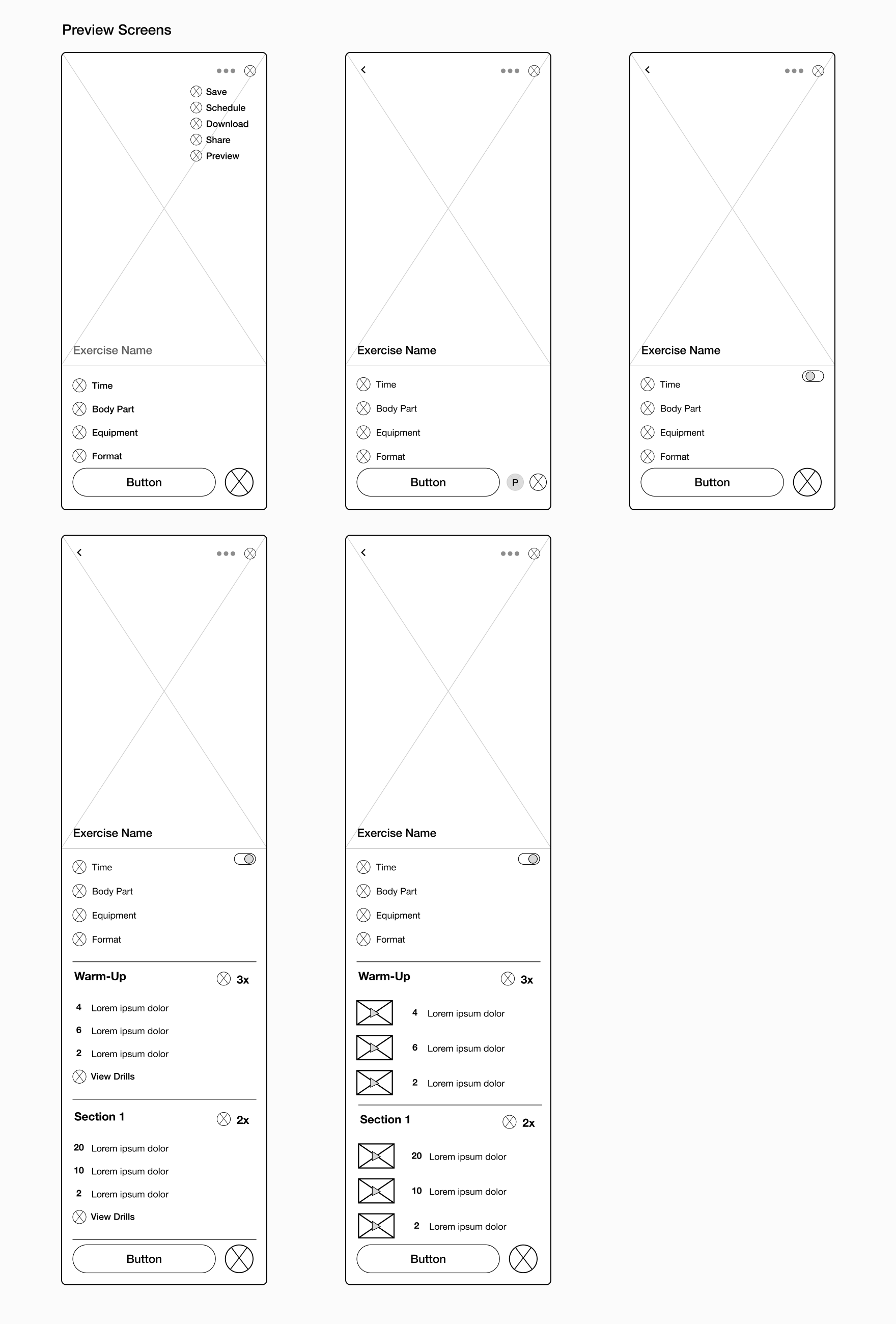
Preview Flow
Initially for the preview flow, I was unsure how to present it on the screen: in the menu, as a separate button, or as a toggle.
I also was debating between showing videos of the workouts on the preview screen or having the user click on a button to see all of them (similar to the way the whiteboard workouts are designed).
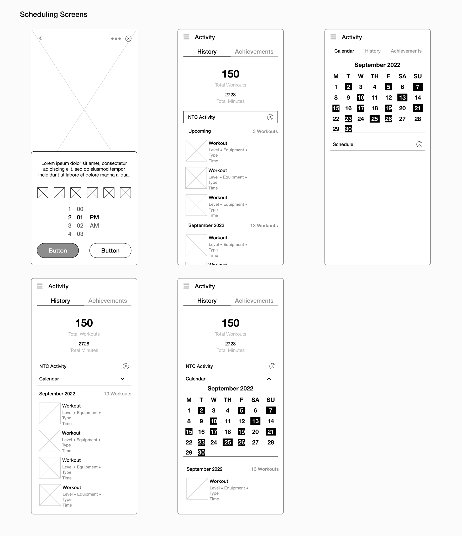
Scheduling Flow
For the scheduling flow, I copied the iOS version of the schedule element. For the calendar on the Activity page, I was unsure if I should show only upcoming workouts, a calendar, or both.
Downloading Flow
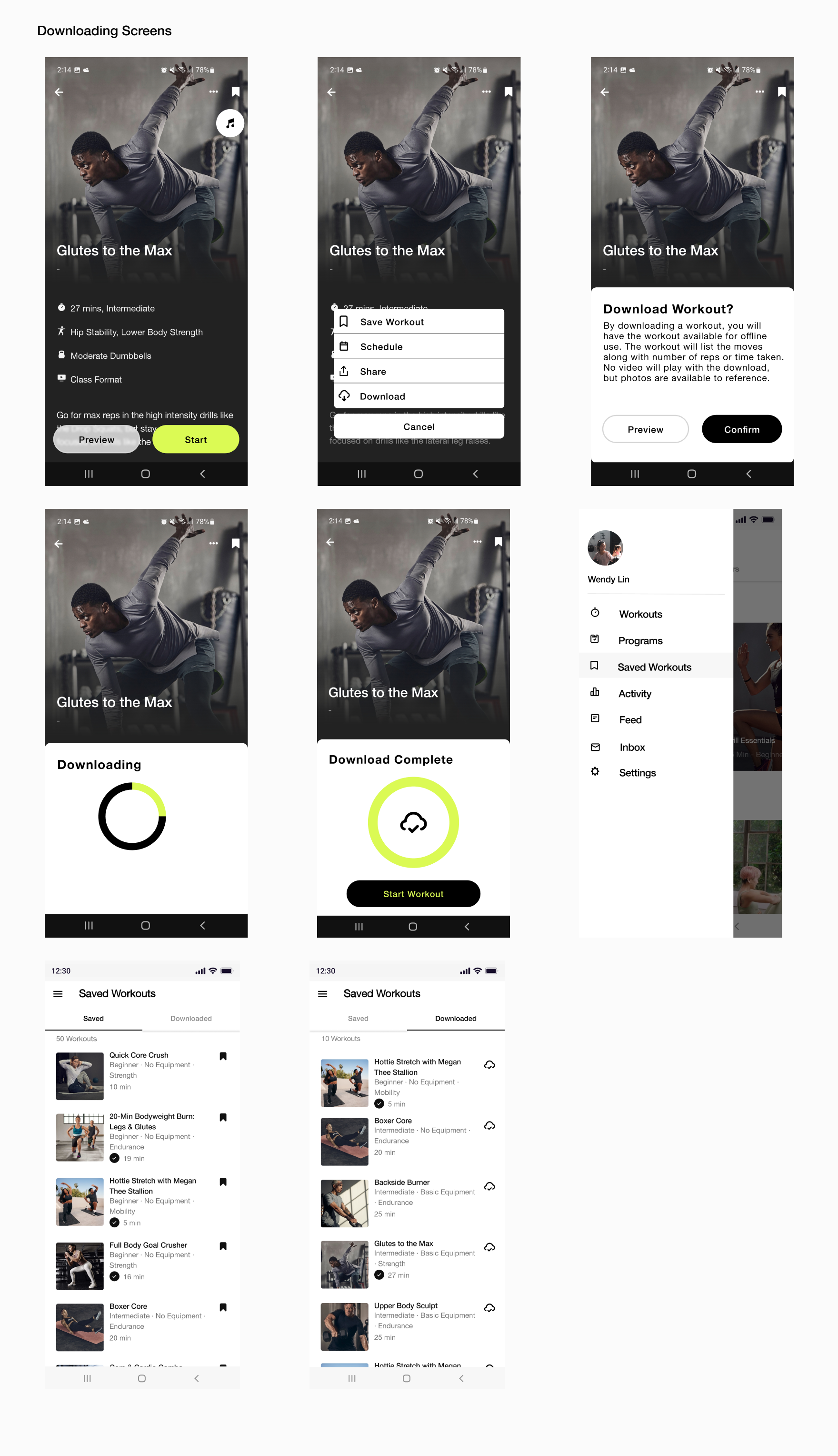
Similar to the preview flow, I was still working on how I wanted to approach the menu pop-up. A downloaded workout would open to a new screen, displaying images or videos so the user knows how to properly perform the exercise.

Screenshots Sped Up The Process
Since I was adding a feature to Nike Training Club, I took screenshots of the screens I was focusing on and built my high-fidelity mockups from them.
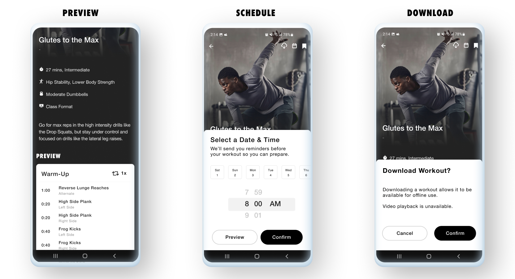
Preview Flow
After feedback, I added a secondary preview button at the bottom of the class screen. From there, a user could preview the entire workout along with the move.
Scheduling Flow
I came to a final decision on the menu! Looking at the iOS version of Nike Training Club, I modeled the Android version in a similar matter, helping to keep the exercise screen cleaner (or so I thought).
The Activity page now has a calendar and an upcoming scheduled workouts section.

Downloading Flow
Like in the Scheduling flow, users can access the Download option from the menu at the top of the screen. Users have the ability to start the workout or hit the back button to look at other options.
These Tests Are Going to Go Perfect, Right?
After working on my first round of high-fidelity prototypes, I put my designs through Maze and began unmoderated user testing. Over the course of three days, five users completed the NTC prototype flows.

Icons from Storyset


The feedback, initially, was really hard to sort through. I thought I knew exactly what users wanted because I knew what I wanted as a NTC user, but instead they let me know what did and didn’t work for them.
Remember That Reminder Earlier? Listen to Your Users
After receiving and synthesizing the usability test results, I made iterations to my screens to make them simpler and more efficient for my users.
Preview Flow
From 5 screens to 2 screens to 1 screen, the Preview flow was simplified to match Nike Run Club. Users can still preview the entire workout and view the moves via videos to determine if it’s an appropriate workout for them.

Scheduling Flow
The menu that I thought I needed, ended up getting completely eliminated. I kept basing my designs off the iOS version instead of taking into account that Android apps requires different needs.
Both the schedule and download buttons are next to the bookmark button making it easy for the user to find.

Downloading Flow
Users now have the option to start their downloaded workout or view all of their downloaded workouts on the Saved Workouts page.
When a user is in a downloaded workout, they can tap on a section once completed and the upcoming section becomes active.


