Timeout Sports Bars
Responsive Desktop and Mobile Application
Role
UX Designer
UI Designer
UX Researcher
Branding
Timeline
August - Mid-September (6 Weeks)
Tools
Figma
Figjam
Zoom for moderated testing
A Sports Bar that Surivives Against All Odds

The current website is outdated, inaccessible, and doesn’t properly reflect who Timeout is, their goals, or what they’ve accomplished.

The updated Timeout website now successfully showcases who Timeout is, along with streamlining information to help grow the business.

Timeout Sports Bar Prototype
An Outdated Website Can Lead to Confusion
Timeout wants to showcase their catering and private event opportunities, encourage online ordering, and reach a younger demographic to grow their business.
Currently, Timeout’s website is over bloated with outdated information making it hard for users to navigate the website.
Timeout Homepage
The homepage is one long webpage with no hierarchical structure, very little white space, and too much information for the user to navigate and process.
Catering information is all the way at the bottom of the page (if the user makes it down that far).


Timeout Menu
Similar to the homepage, the menu is one long webpage with 5 different menu categories, forcing the user to scroll through the page to find the product they’re looking for.
Menu photos are inconsistent in their layout and for which items they’re used for.

Timeout Locations
As seen on the navigation bar, the locations are divided into two separate tabs: one for Timeout #1 (the original location) and one for the other 4 locations, with each location having its own separate page.
On the page itself, there is too much information and it is lacking a hierarchical structure.

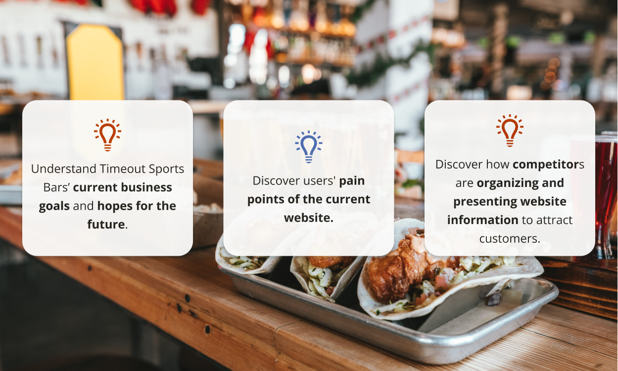
What are the Possibilities for Timeout Sports Bars?
I met with the Communications and Operations Manager for Timeout Sports Bars to learn more about the goals of Timeout Sports Bars. Some of the goals she mentioned were:
Showcase and maintain Timeout’s identity while modernizing it
Increase online ordering
Highlight catering and private events with Timeout Sports Bars
Attract a younger demographic
Currently, the Communications and Operations Manager manages a lot of different tasks including day-to-day tasks, updating Timeout’s social media, hiring new employees, and being the primary point of contact for problems.

Let’s Get on the Same Page
User Thoughts and Feedback
Four users participated in research interviews in which they talked about their sports bar & restaurant experience, along with testing the current website to see if their pain points matched my hypothesis.
What Are Timeout’s Competitors Doing?
During my meeting with the Communications and Operations Manager, she mentioned Timeout’s top competitors and what she liked about each of their websites and business approaches.
The Freedom to Do What I Wanted
The Communications and Operations Manager was open to any ideas I had and wanted to pursue. Considering the Communications and Operations Manager’s needs and pains, the updated website needed to streamline information and needs to be simple to update.
Meet Devon & Theresa
Two personas were created based on user interviews and information about Timeout’s current and potential clientele.
Reshaping the Timeout’s Structure
Currently, Timeout’s website is disorganized with not hierarchical structure including the homepage being full of information that users don’t read. I wanted to streamline information into categories so users could easily find the information they need.
Time to Start Designing
Both of Timeout’s desktop and mobile pages needed enough information for users to get what they need, but not be overwhelmed.
Interviewees wanted to see more photos and branding, so I wanted to include more opportunities for photos and branding in the new designs.
Homepage Wireframes
There were multiple ways I thought about presenting information on the homepage including a video or a slideshow to showcase Timeout’s offerings.
I knew that I wanted to include a call-to-action for online and ordering and catering information on the homepage.
Catering Wireframes
Catering and private event information now has it’s own page, rather than being hidden on the homepage. I also wanted to include a form rather than just contacting Timeout to make it easier for the Operations and Communications Manager to keep track of requests.

Menu Wireframes
I wanted to make it easier for users to switch between menu categories. I also introduced allergen and dietary restriction information (which was mentioned by participants during my research phase).
I also wanted to utilize a slideshow to highlight menu specials such as the lunch special or weekly specials.

Location Wireframes
For Timeout’s locations, I knew I wanted to put all of the locations on one page. It makes no sense for them to be on separate tabs on the navigation bar.
History about Timeout Sports Bars can be included on a new About page.

Before We Get Too Far, Let’s Test
After completing my lo-fi wireframes, I built out my mid-fi prototypes for usability testing.
Three users participated in both the desktop and mobile prototypes of Timeout’s website to determine if users could easily find information related to private events, locations, and the menu.
What Needs to Be Addressed ASAP
The slideshow on each menu page was distracting.
The term “Main Event” for entrees was an incredibly confusing phrase and participants were unsure of what the category meant.
There should be a location option on the catering/private event form.
Timeout’s Homepage
With feedback from testing, I reformatted the homepage to include catering information and location information.
I also took Timeout’s highlights such as food and entertainment offerings, and turned those into separate cards to emphasize them.

Timeout’s Catering Page
The catering page had very few changes, with the exception of moving the slideshow and adding a location question.

Timeout’s Menu
The menu page had the most updates due to user feedback. Instead of keeping the original 5 categories, the menu is now divided into: Timeout Favorites, Shareables, and Main Dishes.
The CTA is both in the navigation bar and at the bottom of the page, along with a PDF download of the menu (which was mentioned back during the research phase).

Timeout’s Location Page
For both the desktop and mobile version, the location page includes important information such as the address, operation hours, and if there are any age restrictions.
Users can also see a map of where the bar is located. On mobile, users can get directions from their preferred navigation app.

Refreshing Timeout’s Brand
Instead of completely redesigning Timeout Sports Bars, I wanted to give it a refresh to maintain the spirit of Timeout while modernizing the brand. One thing I kept was the logo because the owner’s friend created it before the bar opened.
I kept the orange and blue color scheme, but updated the font and photo guidelines.
Meet the New Timeout Sports Bar Website
Timeout’s Homepage
The homepage has now been streamlined and cleaned up. Users can easily navigate the page to find the information they’re looking for.
All the pages have updated UX writing to make the website more engaging and easy to reach their goal.

Timeout’s Catering Page
Timeout’s current and new clientele can easily book events with Timeout through a streamlined private event form.

Timeout’s Menu Page
Did I get hungry when working on the design for the menu page? Absolutely, but now users can easily search for what they want to order.
Food specials are highlighted on the page slideshow and users can order online at any point.

Timeout’s Menu Page
Not every page needed a slideshow, so I removed the slideshow from the location page. Timeout #3 - Pasadena is currently closed and ensured that users could easily get that information.